
The Night I Realized Crypto Charts Were Not Written in Alien Language
I remember sitting in front of my glowing laptop monitor at two in the morning, watching bright green and red lines flash across my screen. My heart was pounding fast, my eyes were burning from fatigue, and I felt completely lost in a sea of confusing chart indicators. I had just bought my very first fraction of digital currency, but I had zero clues whether the market was about to shoot up or crash down. Every time I tried searching online for simple chart explanations, I was flooded with complex mathematical jargon and scary trading terms. I felt deeply anxious, confused, and utterly stupid because I just wanted to make sense of where my money was going. That night, I came very close to closing my trading account for good out of pure frustration.
Many everyday people enter the digital market with huge excitement, hoping to build a better financial future. However, that early excitement quickly turns into heavy stress the moment they open a real-time trading screen. Staring at hundreds of moving red and green bars can make anyone feel completely powerless and paralyzed. You find yourself second-guessing every single choice, wondering if you bought at the absolute peak or sold right before a massive upward rally.
This daily confusion creates a quiet emotional toll that ruins your peace of mind. You start checking your phone every five minutes during dinner, while working, and right before trying to sleep. The constant fear of making a bad move makes chart analysis feel like a high-stakes gambling game meant only for math experts.
When you trade without understanding what you are looking at, every market movement feels like an emotional roller coaster. You watch your hard-earned money move up and down while feeling like you have zero control over the outcome. The good news is that reading price charts does not require a complex college degree or hours of painful math. Once you learn to view price bars as simple human stories, everything becomes clear, quiet, and manageable.

Decoding the Glow: What a Single Candlestick Actually Tells You
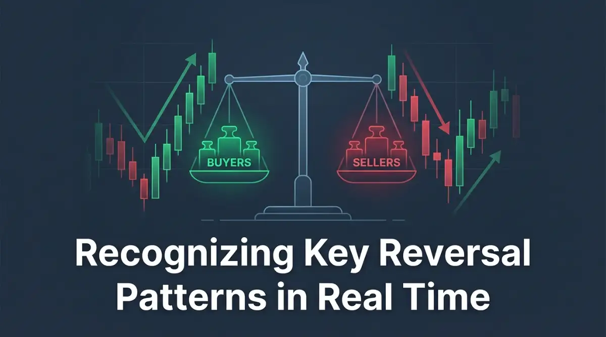
To read price charts without getting a massive headache, you must start with the single price bar. Think of a single price candle as a quick snapshot of a battle between two teams: buyers and sellers.
Every single candle on your screen represents a specific window of time, such as one hour or one day. During that chosen time frame, the candle records four distinct price points that show who won the market battle.
The thick rectangular part of the candle is called the real body. This solid box shows you where the price started when the time period began and where it landed when time ran out.
The thin lines sticking out from the top and bottom are called wicks or shadows. These thin lines show the maximum extreme prices reached during that specific time window before the price bounced back.
When you see a bright green candle, it simply means buyers were stronger and pushed the price higher than where it started. When you see a bright red candle, sellers took control and dragged the price down lower than where it opened.
Instead of staring at complex math lines, focus purely on who controlled the price box by the time the candle finished. This simple shift in thinking removes almost all technical confusion right away.
The Simple Anatomy of Buyer and Seller Pressure
Understanding market movement comes down to reading price pressure rather than memorizing complicated names. The size of the candle body and the length of the wicks tell you who is getting tired and who is taking control.
A very long green body shows strong, confident buying energy with almost no resistance from sellers. On the other hand, a candle with a tiny body and tiny wicks means neither side had enough power to move the price anywhere meaningful.
The wicks are actually the most interesting part of any price bar because they reveal failed attempts by either buyers or sellers. A long upper wick means buyers tried to push price sky-high, but sellers stepped in and slammed it back down.
Conversely, a long lower wick shows that sellers tried hard to push prices down, but eager buyers rushed in to eat up the discount. Watching where these price rejections happen helps you spot market turns long before they happen.
Let us look at a simple real-life example to make this crystal clear for your everyday reading. Imagine Bitcoin opens at fifty thousand dollars at nine in the morning on a fresh daily chart.
During the day, panicked sellers push the price all the way down to forty-seven thousand dollars. However, before the day ends, strong buyers buy up the supply and push the final closing price back to forty-nine thousand five hundred dollars.
That whole story gets recorded as a candle with a small body near the top and a massive tail sticking out at the bottom. By just looking at that long bottom tail, you instantly know sellers tried to crush the market but completely failed.
Four High-Probability Patterns You Can Spot Instantly
You do not need to memorize dozens of obscure chart shapes to make clear sense of the market. Mastering just four core visual patterns will give you more than enough confidence to read charts cleanly.
The Reversal Hammer Pattern
The Hammer pattern looks exactly like its name, featuring a short top body and a long lower tail that is at least twice as long as the body. This pattern usually shows up after a long downward trend in price.
When you spot a Hammer, it signals that sellers pushed price hard, but buyers completely rejected those low prices. It strongly hints that the downward price slide is losing steam and an upward bounce might be right around the corner.
The Doji Pattern
A Doji happens when the opening price and closing price are almost identical, creating a candle that looks like a thin cross or plus sign.
This simple shape means total indecision in the market place. Neither the buyers nor the sellers could win the upper hand, warning you that the current price trend is getting tired and might freeze or switch directions soon.
The Bullish Engulfing Pattern
This powerful two-candle combo occurs at the bottom of a price drop. The first candle is small and red, showing weak selling activity.
The second candle is a giant green candle whose body completely covers or swallows the previous red candle's body. This visual takeover tells you that buyers have aggressively jumped back into the driver seat.
The Bearish Engulfing Pattern
This pattern is the exact opposite of the bullish engulfing setup and usually appears after a price rally. It starts with a small green candle followed immediately by a large red candle that completely covers the green one.
It signals that buying momentum has completely vanished and eager sellers have stormed back into control, often pointing to an upcoming price drop.
When I started learning chart reading, my biggest mistake was trading every hammer pattern I saw on one-minute charts without checking the bigger picture. I quickly learned that patterns are far more reliable on four-hour or daily charts because lower timeframes are mostly random noise.
If you want to see these exact candlestick patterns form on live interactive charts step by step, check out this simple video guide that breaks down real setups cleanly.
Common Myths Versus Market Reality
Many chart guides lead beginners down the wrong path by making promises that do not match real price behavior. Let us clear up a few major misconceptions so you can keep your expectations realistic and safe.
The biggest myth is believing that a specific candle shape guarantees an immediate price move. In reality, candlestick shapes only show probability, telling you what is likely to happen next based on recent buyer behavior.
Another common myth is that you need to watch one-minute charts all day to find profitable moments. The truth is that tiny timeframes contain endless fake signals that exhaust your energy and confuse your decision-making.
Focusing on daily or four-hour charts gives you plenty of time to analyze shapes calmly without feeling rushed. Always remember that a single candle pattern is just one clue out of many on your screen.
Reading Patterns in Context with Key Support and Resistance
Thinking of a candlestick pattern in isolation is like trying to understand a full movie by watching a two-second clip. To read the true message on your screen, you must look at where that pattern appears on your chart.
The most powerful place to watch for candle shapes is near major price floors and price ceilings. Traders call these critical chart areas support and resistance levels.
A support level works like a solid concrete floor where buyers historically step in to catch falling prices. On the flip side, a resistance level acts as a heavy ceiling where sellers jump in to take profits and stop price rallies.
When a strong reversal shape forms right on top of one of these key boundaries, its reliability shoots up fast. It turns a simple candle shape into a high-probability market setup.
Picture Ethereum dropping steadily for five straight days until it hits a historical price floor at two thousand dollars. Out of nowhere, a massive Bullish Engulfing pattern forms right on top of that exact two-thousand-dollar line.
This powerful combo tells you a crystal-clear story that anyone can understand. Eager buyers are guarding that price floor with serious conviction, making a strong upward bounce much more likely.
Now, imagine seeing that exact same green pattern floating randomly in the middle of nowhere on your chart. Without a sturdy price floor underneath it, that pattern is far more likely to be a tricky false signal.
Always pair your candle shapes with strong chart locations before taking action. Combining location with shape is the single easiest way to protect your capital from expensive traps.
Simple Daily Steps to Practice Chart Reading Without Stress
Building confidence in chart reading does not happen overnight, but it can be completely painless if you follow a low-stress routine. You do not need to risk real capital while learning how to spot these shapes correctly.
Start by opening a free chart viewing website and turning off all complex technical overlays, squiggly lines, and mathematical indicators. Leave only clean red and green price candles on your screen so you can focus purely on raw price action.
Next, set your chart timeframe to the four-hour or daily view to eliminate noisy, unpredictable movements. Spend ten minutes each day scanning major digital assets simply trying to spot Hammers, Dojis, and Engulfing patterns.
Keep a basic notebook or digital journal where you paste screenshots of the patterns you find along with a short note. Write down what happened to the price over the next few candles after the pattern finished forming.
Over time, your brain will naturally train itself to recognize buyer and seller battles without feeling overwhelmed or anxious. You will move from staring at scary glowing lines to comfortably reading clear market stories with total ease.
Pro-Level Secrets for Reading Candlestick Signals Like an Experienced Trader
Once you understand basic candle shapes, you can start combining them with small professional tricks that boost your accuracy. These advanced methods help you separate true market shifts from deceptive price traps.
The first major secret is watching trading volume right alongside your candlestick patterns. Trading volume shows you how many total coins were traded during the exact time that specific candle was forming.
When a Bullish Engulfing candle forms with massive trading volume behind it, it means large institutional investors are actively buying. However, if that same pattern forms with tiny volume, it suggests weak retail interest that could easily collapse.
To dive deeper into financial market research and risk management, you can check official investor guidelines provided by the SEC Investor Education and Bulletins. Learning how major regulatory bodies view market liquidity helps you respect the underlying mechanics of digital asset trading.
Another powerful secret is comparing candle shapes across multiple timeframes before making any decisions. This simple technique is often called multi-timeframe analysis by seasoned market participants.
For instance, a Hammer candle on a fifteen-minute chart might look like an immediate buying signal to an impatient trader. However, if you zoom out to the daily chart, that tiny Hammer might just be a minor pause in a massive downward slide.
Always ensure the smaller timeframe pattern aligns with the overall direction shown on the higher daily timeframe chart. Aligning your trade with the dominant trend dramatically increases your odds of staying on the right side of the market.
It is also worth tracking long-term macro research from institutions like the Federal Reserve Board to understand how broader interest rates influence overall market liquidity. Macroeconomic conditions heavily dictate whether candlestick patterns lead to sustained rallies or sudden failures.
Additionally, pay close attention to where the candle closes relative to its total length. A candle that closes near its absolute highest point shows pure buyer strength with zero late-day selling pressure.
If a candle moves up fast but gives back most of its gains before closing, buyers are clearly running out of fuel. This simple habit of measuring the close relative to the range keeps you grounded in reality.
To maintain your focus during long chart study sessions, taking care of your physical setup is just as important as reading price wicks. If you spend hours sitting at a desk analyzing markets, reviewing tips on protecting your physical ergonomics can keep lower back pain from ruining your daily concentration.
Maintaining great chart reading results over several years requires building a calm, repeatable routine rather than chasing constant excitement. Set fixed daily times to review your charts rather than staring at live ticking candles all afternoon.
Keeping your chart reading routine systematic prevents emotional burnout and keeps your thinking sharp. Treat chart analysis like reading a daily weather report rather than a high-stakes guessing game.
Dangerous Traps That Cause Beginner Traders to Lose Money
Learning to read candlesticks is just as much about knowing what not to do as it is about spotting good setups. Many beginners fall into the exact same painful emotional traps that drain their bank accounts and destroy their confidence.
One of the most dangerous traps is trying to catch a falling knife by buying every single Hammer candle during a panic selloff. When market panic hits, price can violently slice through multiple support levels without giving buyers a chance to breathe.
Seeing a lone Hammer candle during an aggressive market crash is often just a temporary pause before another wave of selling hits. Waiting for price to actually stabilize and form a solid base is far safer than jumping in blindly on the first bottom tail.
Another huge mistake is overtrading on ultra-short timeframes out of intense fear of missing out. Staring at one-minute or five-minute charts triggers deep emotional reactions because candles move fast and flicker constantly.
This high-speed stress often leads to late-night screen addiction that ruins your natural sleep cycle and overall health. If late-night chart watching is keeping you awake, learning practical strategies for reducing screen blue light before sleep can protect your rest and improve your mental recovery.
When you trade on tiny timeframes, you end up paying high trading fees while reacting to meaningless market noise. You get chopped up by false breakouts and end up feeling exhausted, angry, and defeated.
Many traders also fail because they ignore broader technological trends and economic factors that impact asset adoption. For example, tracking global research benchmarks like the Cambridge Centre for Alternative Finance provides valuable context on how network growth supports price floors.
Ignoring the bigger picture leads to trading candle shapes in isolation, which is a fast recipe for repeated losses. A candle pattern only works well when the underlying market environment supports the move.
The emotional toll of making these repeated mistakes can bleed into your daily life and personal relationships. Experiencing constant financial anxiety leads to poor sleep, low productivity at work, and a feeling of permanent mental fog.
If you find that market stress is starting to spill over into your daily life, taking time to focus on managing digital mental health can help you regain emotional balance and perspective. Chart analysis should empower your life, not consume your mind with constant worry.
Finally, beginners often risk far too much money on a single chart pattern because they feel overly confident. No matter how perfect a Bullish Engulfing candle looks, unexpected news can instantly flip the market red.
Always protect your capital by placing a sensible stop-loss order right below the invalidation point of the pattern. That way, if the pattern fails, your loss remains small and completely manageable.
Your Action Plan for Stress-Free Chart Reading
Mastering crypto candlestick patterns is not about predicting the future with absolute certainty. It is about learning to read the ongoing story of buyer and seller behavior so you can make calm, informed choices.
By focusing on core patterns like Hammers, Dojis, and Engulfing shapes, you strip away the confusing noise that paralyzes most beginners. You begin to see charts as logical footprints of human emotion rather than mysterious random lines.
To expand your overall analytical thinking beyond financial markets, practicing methods for finding reliable academic research papers can strengthen your ability to verify facts independently. Strong research habits naturally translate into better risk assessment when reading price action.
Remember to always look for candle patterns at key price floors and ceilings rather than taking isolated signals in middle zones. Combining simple candle shapes with basic support and resistance levels gives you a clear edge without technical clutter.
As you build your chart reading routine, keeping your personal finances organized helps reduce trading pressure. Understanding long-term financial principles, such as understanding long-term costs, ensures that you manage your overall capital wisely while navigating volatile markets.
If you are looking for cost-effective ways to back up your chart screenshots and trading logs, exploring options for using free cloud storage tools keeps your study records safe without extra monthly expenses.
When I first learned to read these shapes, my trading transformed from frantic guessing to a quiet, structured routine. I stopped panicking during price swings because I finally understood the story playing out on my monitor.
I know you can reach that exact same level of calm clarity if you take things one simple step at a time. Start practicing on high-timeframe charts today, trust the process, and give yourself permission to learn comfortably without rushing.
Clear Answers to Common Chart Reading Questions
What is the most reliable candlestick pattern for beginners?
The Hammer pattern and the Bullish Engulfing pattern are generally the easiest and most reliable shapes for beginners to spot. They clearly show a strong shift in market control from sellers to buyers. However, they work best when they form directly on top of a major support price floor on higher daily charts.
Why do candlestick patterns sometimes fail?
Candlestick patterns show market probability rather than guaranteed outcomes. Sudden news events, large whale market sells, or shifts in global economic conditions can easily overpower a technical chart pattern. This is why always using a protective stop-loss is necessary to manage risk on every single setup.
Which timeframe is best for analyzing crypto candlesticks?
The four-hour and daily timeframes are widely considered the best options for stress-free chart analysis. These higher timeframes smooth out chaotic price noise and offer far more reliable signals than short one-minute or five-minute charts. They also give you plenty of time to analyze setups calmly without feeling rushed.
Do red and green candle colors mean the same thing on all exchanges?
Yes, bright green candles almost universally mean the closing price was higher than the opening price, indicating buyer control. Red candles mean the closing price was lower than the opening price, showing seller dominance. You can customize these colors on most chart platforms, but green for up and red for down remains the universal standard.
Can I read candlestick patterns without using complex mathematical indicators?
Absolutely, and many professional price-action traders rely entirely on raw candlesticks without any added indicators. Learning to read raw price wicks, body sizes, and key support levels gives you a clean view of the market without cluttering your screen with confusing squiggly lines.
AdSense & Financial Disclaimer
This article is created strictly for informational and educational purposes only. The content provided here does not constitute financial, investment, legal, or trading advice. Cryptocurrency markets are highly volatile and carry a substantial risk of financial loss. You should never invest money that you cannot afford to lose completely. Always conduct your own independent research and consult with a licensed financial advisor before making any investment decisions. The author and website assume no responsibility for any personal trading losses or financial decisions made based on the information presented in this guide.